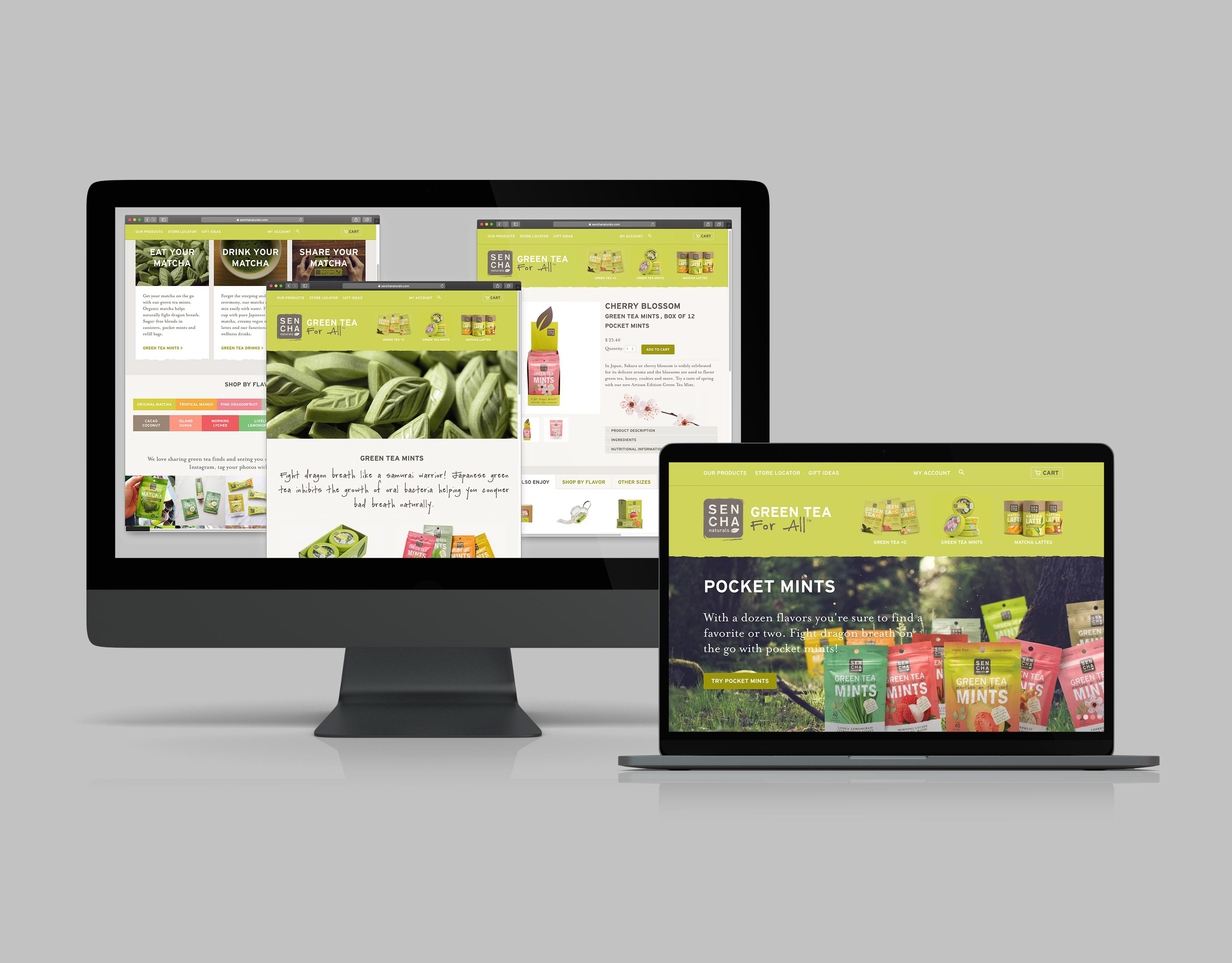
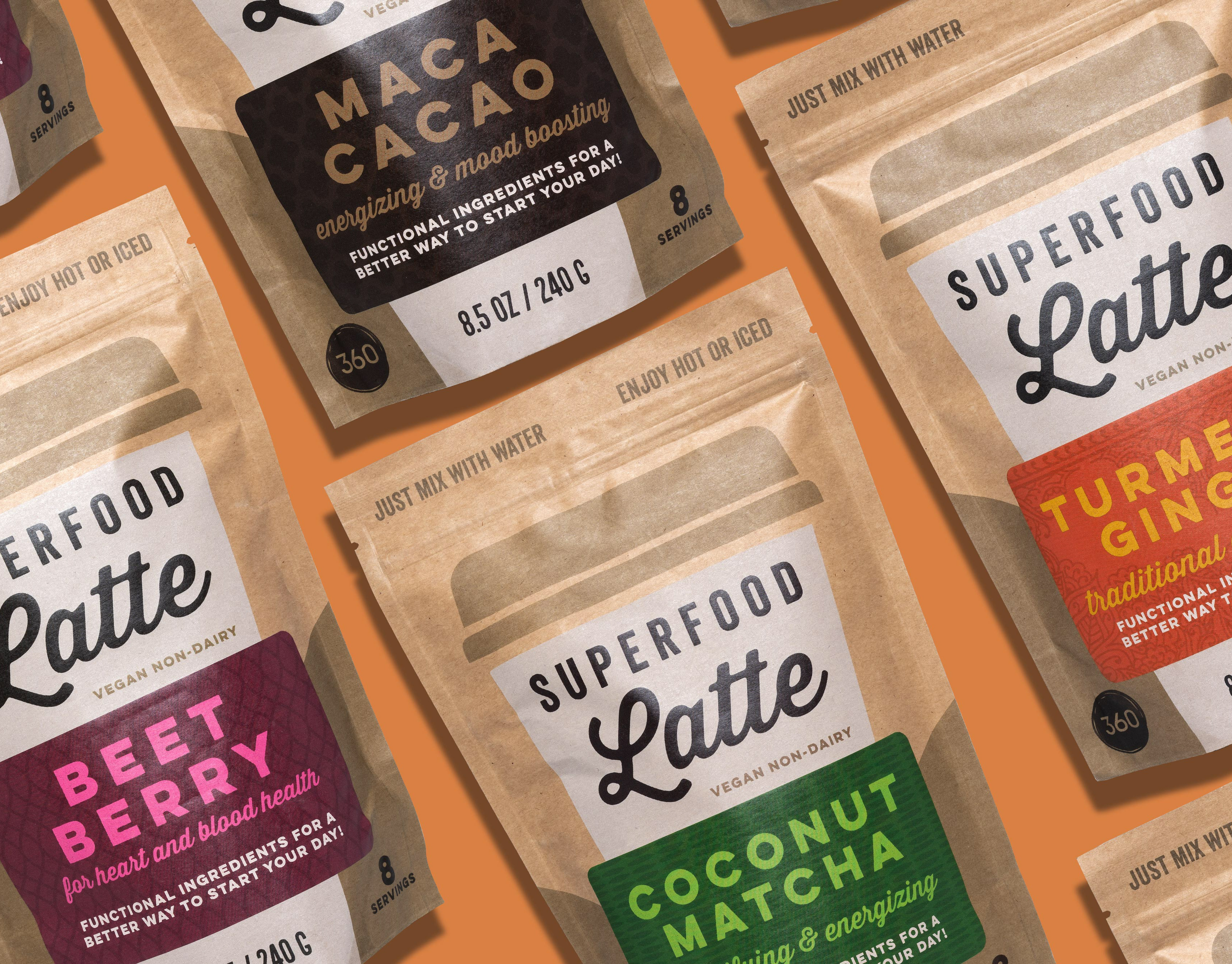
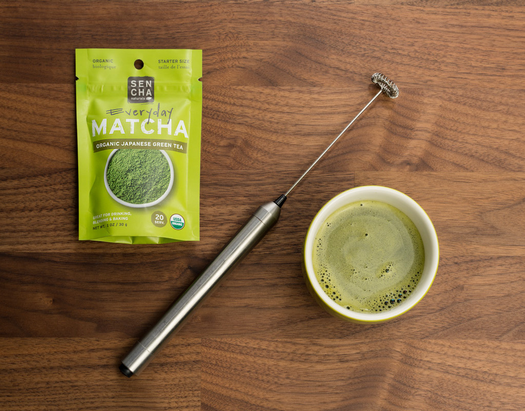
When I joined Outstanding Foods, an outside agency had been developing concepts for a rebranding and packaging refresh. I took their concepts and fleshed out the details, created additional flavors, and developed print-ready artwork files for digital and Pantone print runs. Across 4 product lines with multiple sizes I established and maintained about 50 print files, interfacing with printers for proofs and approvals.
As art director at Outstanding Foods I designed the packaging for Stuffins, a new dairy-free stuff snack line we developed fitting into the family of established product lines. In the design exploration stage I came up with the product name as well as handled the food photography that would be on the packaging.
I started the day with a cup of half-caff coffee to have a steady hand using tweezers to place the Outstanding Stuffins in a precise pile to show off their crispy crunchy shell and smooth savory filling that glistens in the light. Any errant Stuffins definitely had to be taste-tested and it was a three-way tie for best flavor.
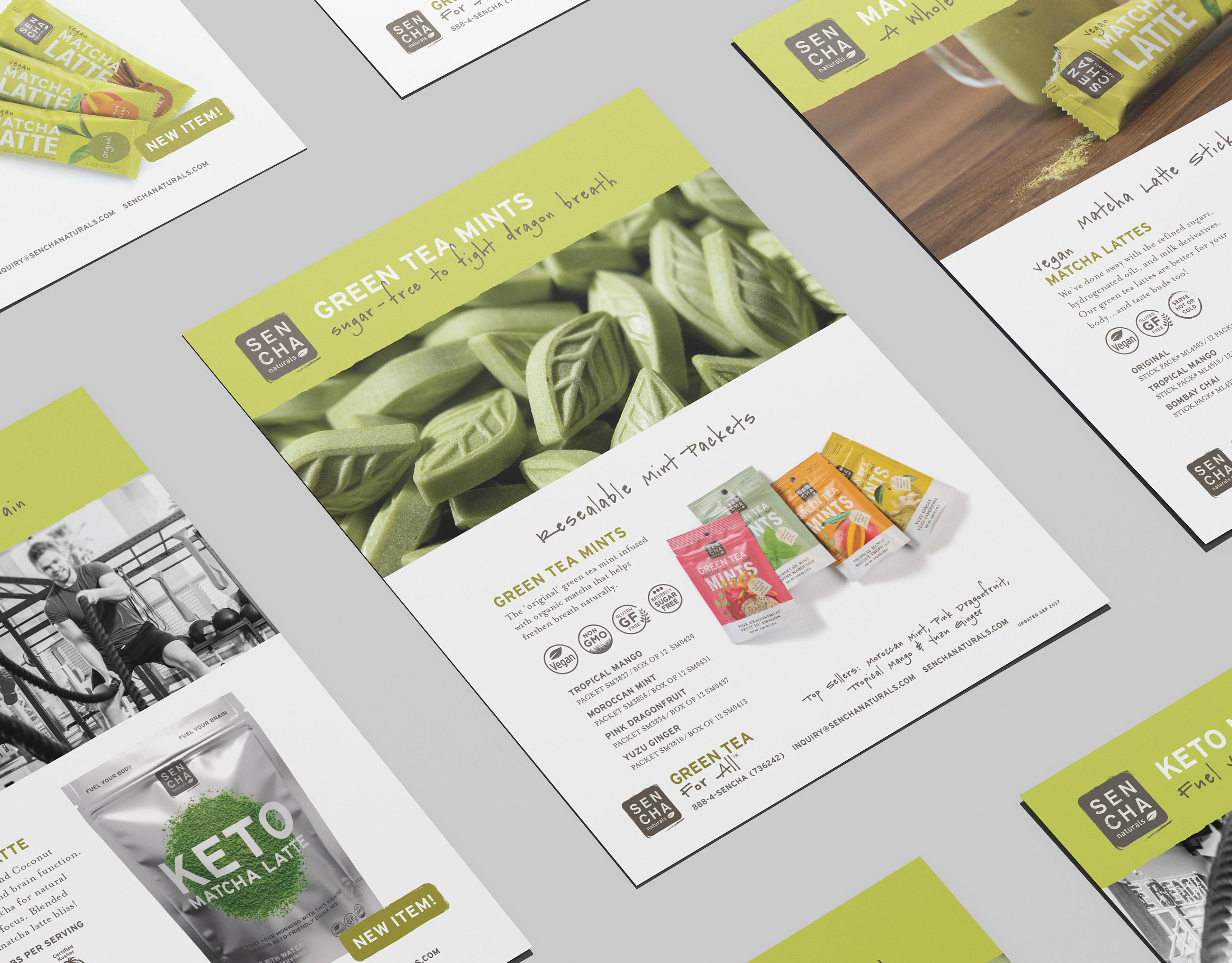
I created a wide variety of sales and marketing collateral such as sell sheets, brochures, and presentations. Each product line had various versions for key buyers and accounts with critical information, nutrition, and selling points. Collateral materials were continually updated to sync with changes in packaging, ingredients, and nutrition information.
Trade shows are an exciting time to pull together the latest packaging, collateral, brochures and of course, booth designs - often elements for a new product launch as well. I designed the graphics for our Outstanding trade show booths for events big and small along with additional marketing materials, tote bags, and branded apparel.
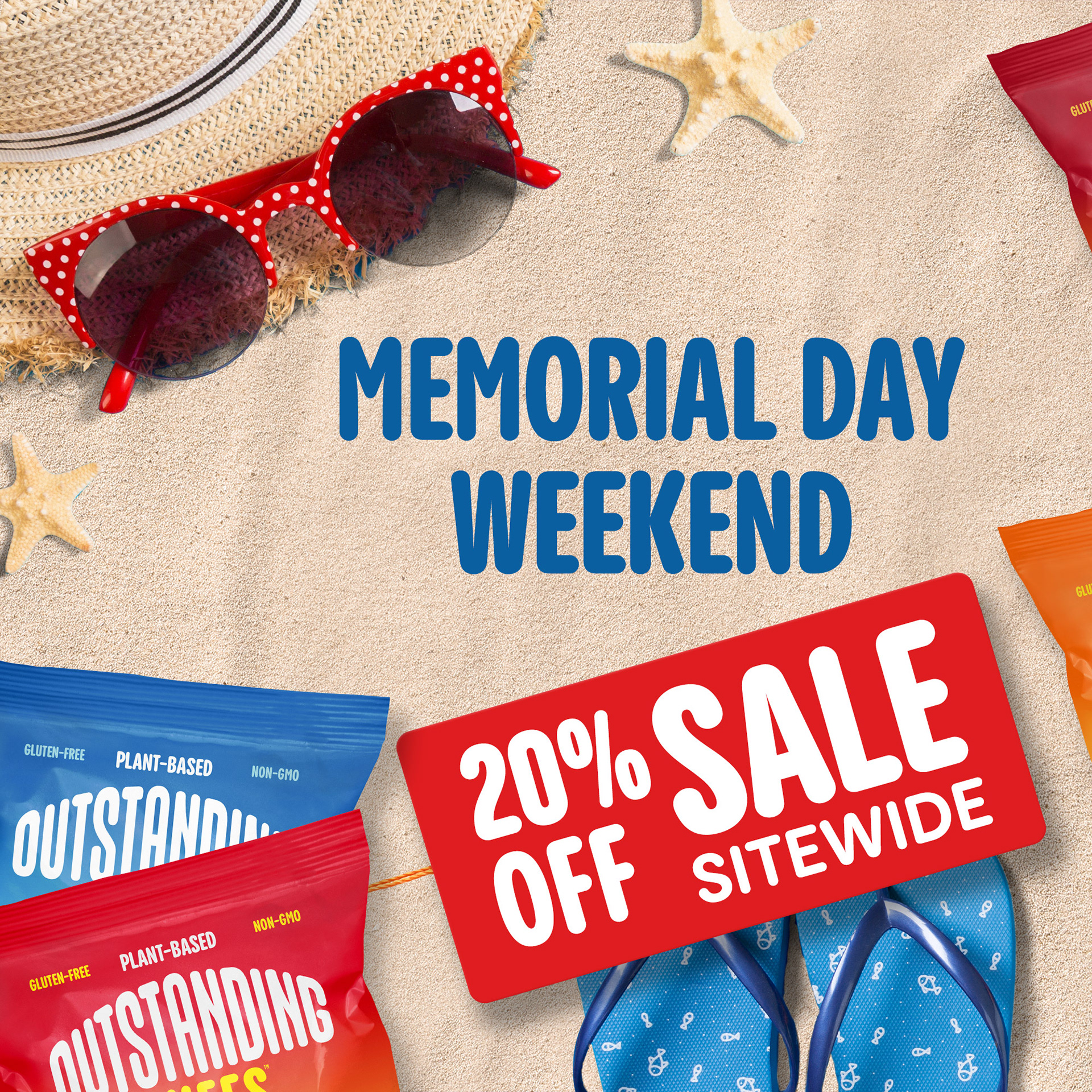
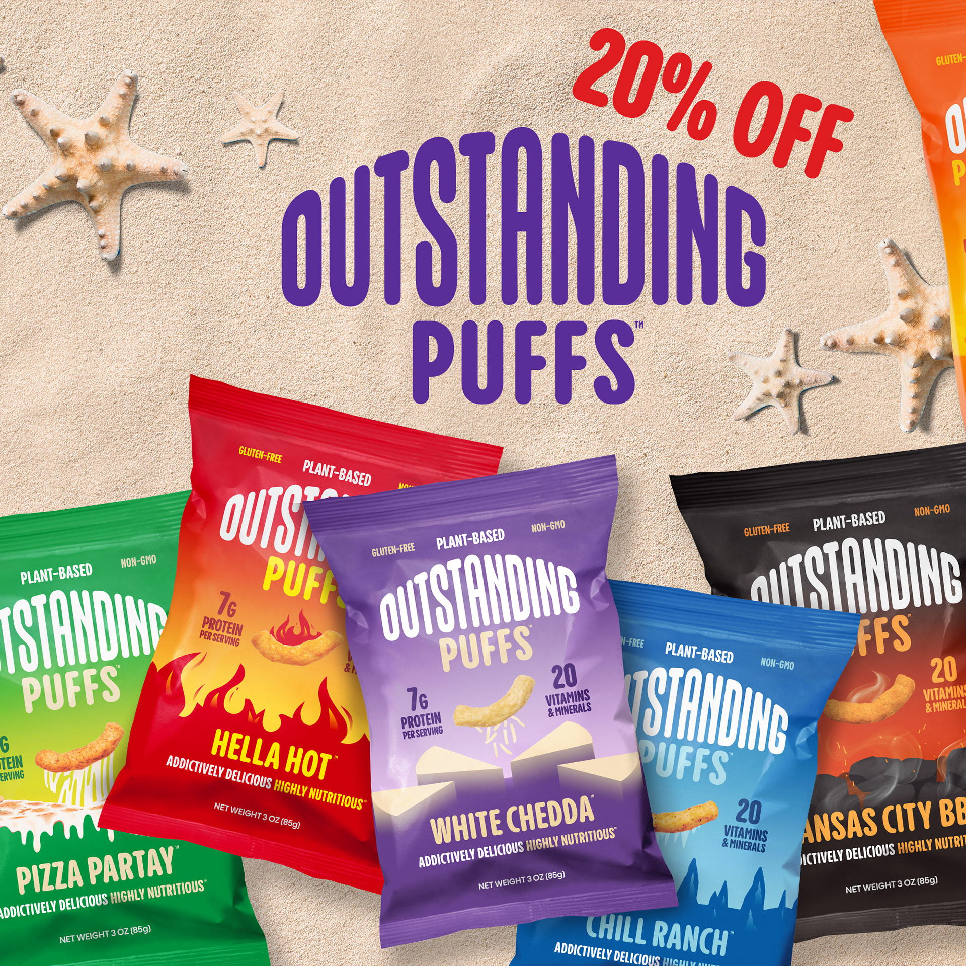
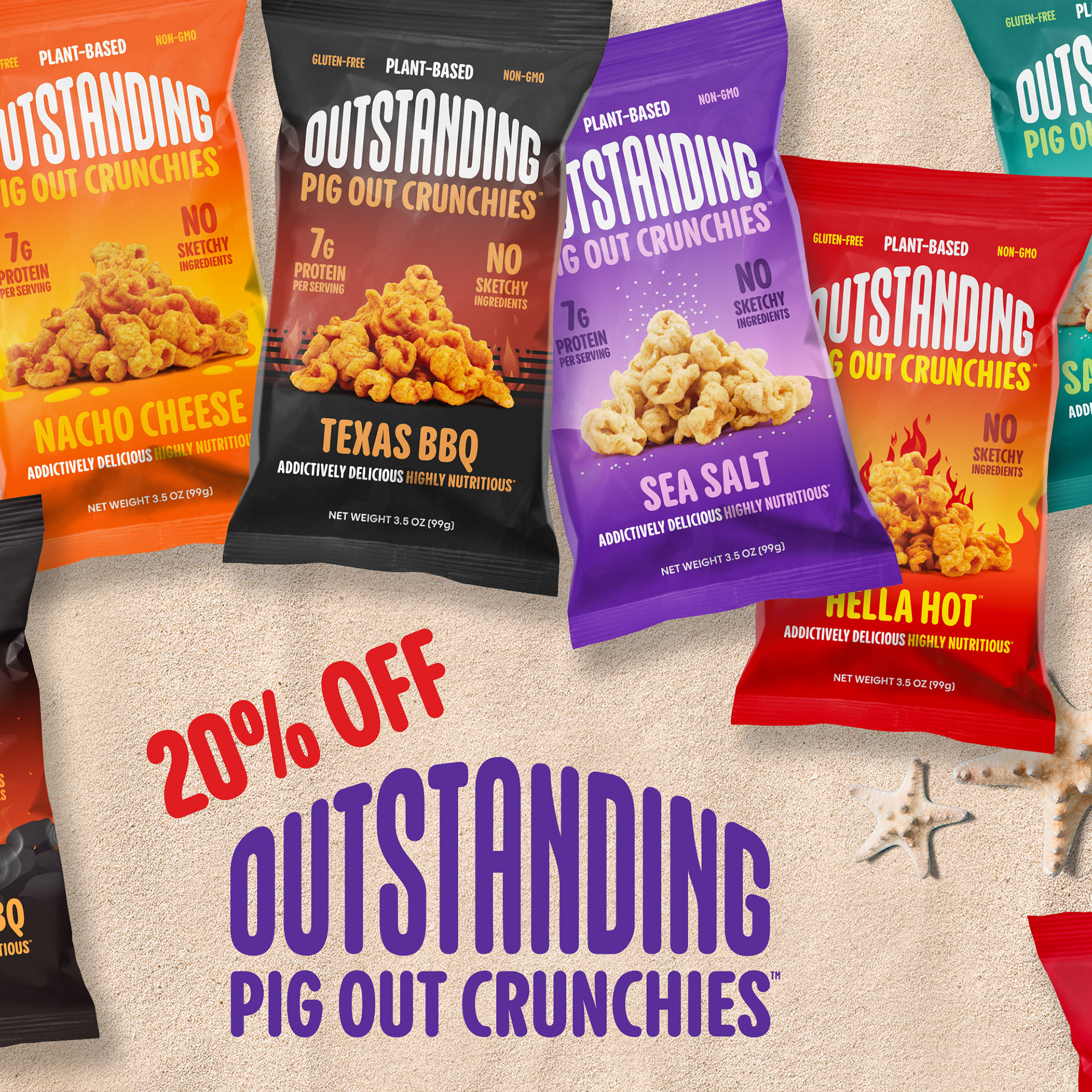
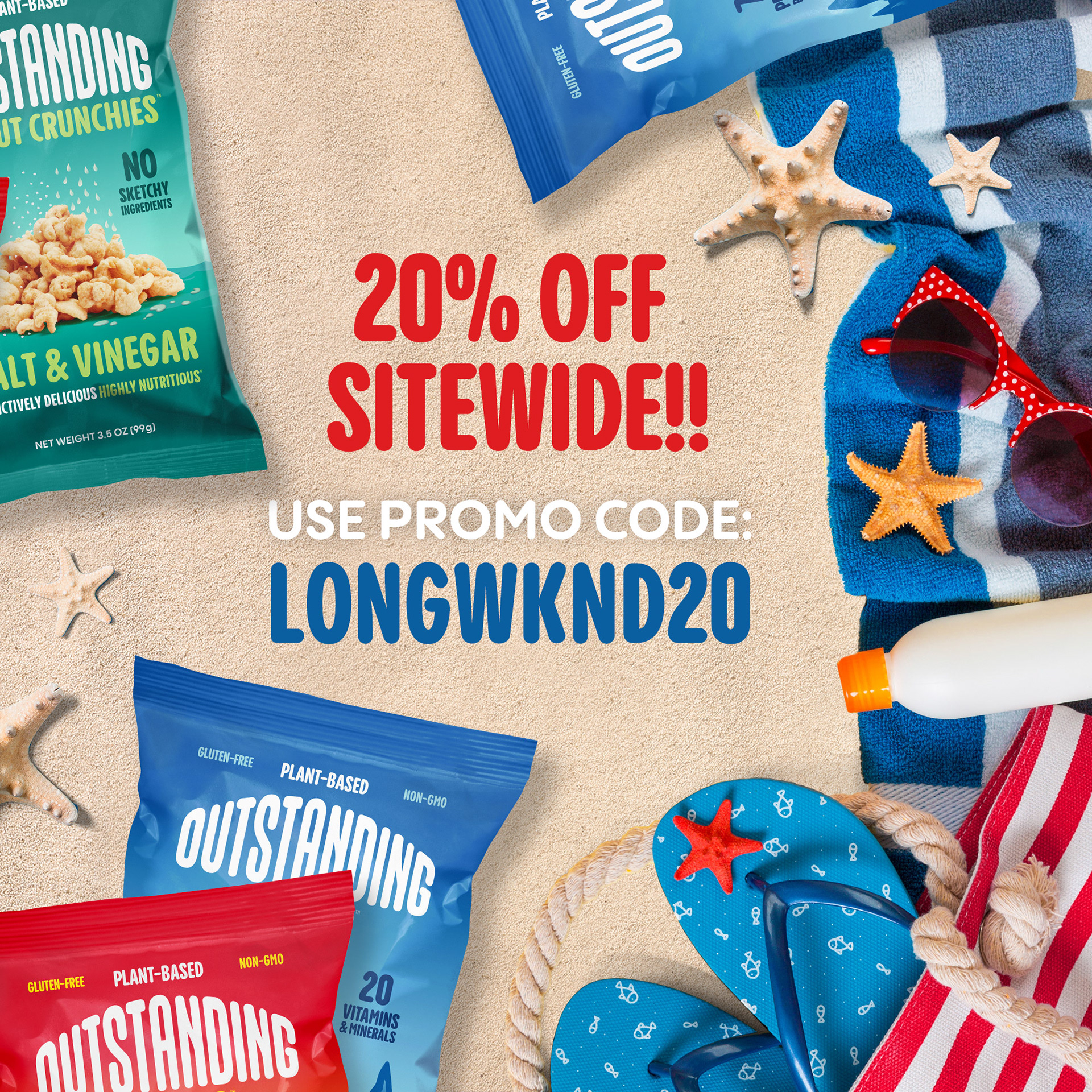
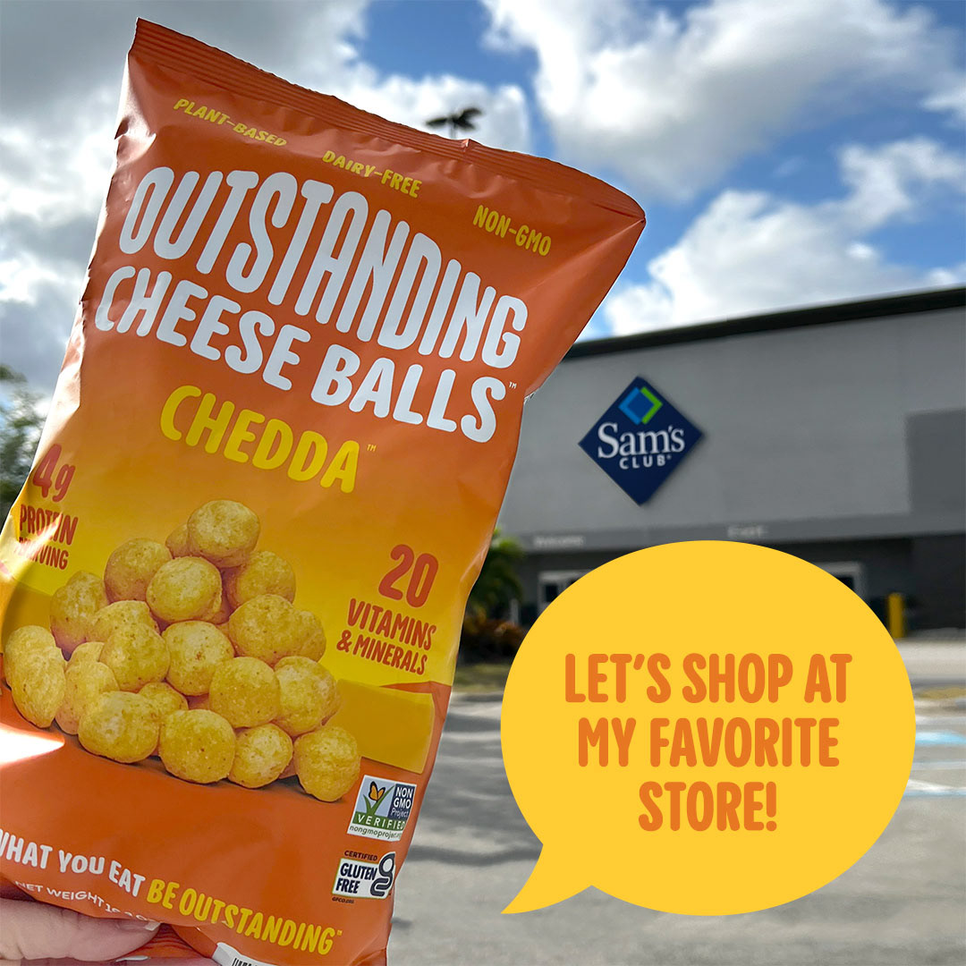
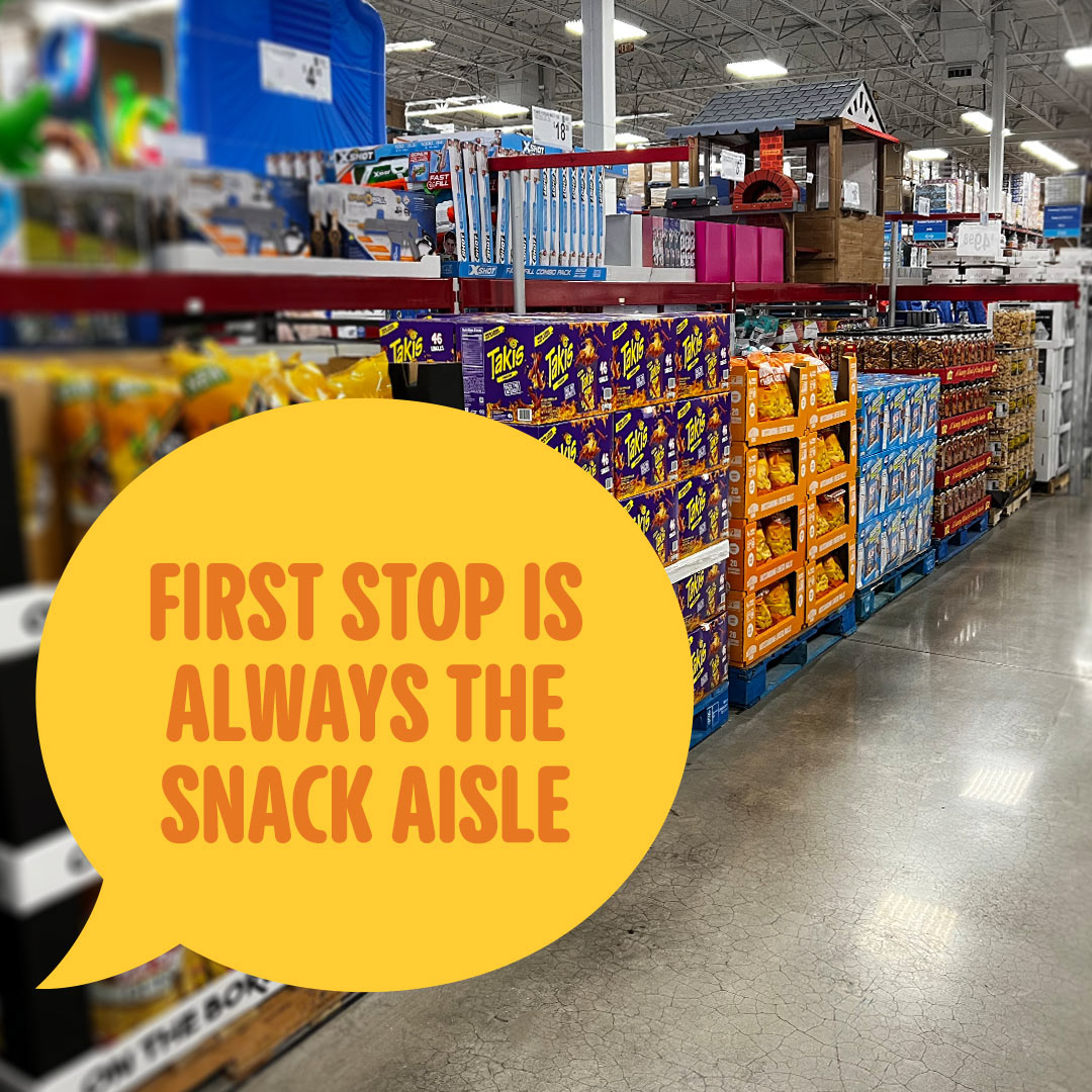
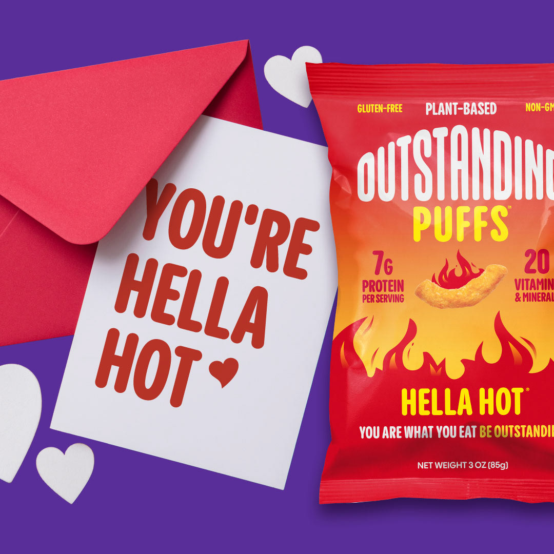
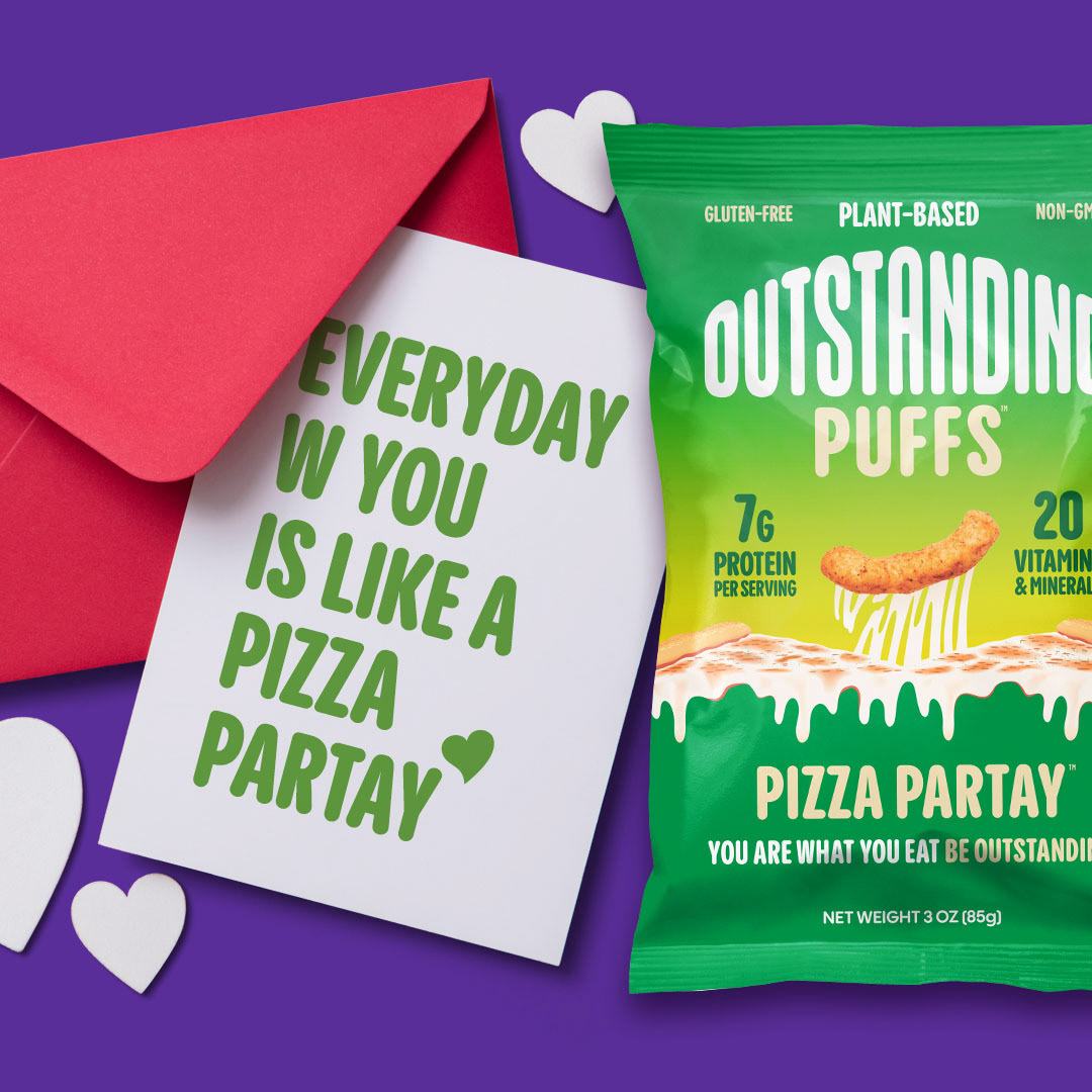
I developed a variety image sets and layouts using product photography, models, stock imagery, and sometimes supplemented with my own product photography to put together Outstanding imagery for product launches, sales and promotions, and social media content.
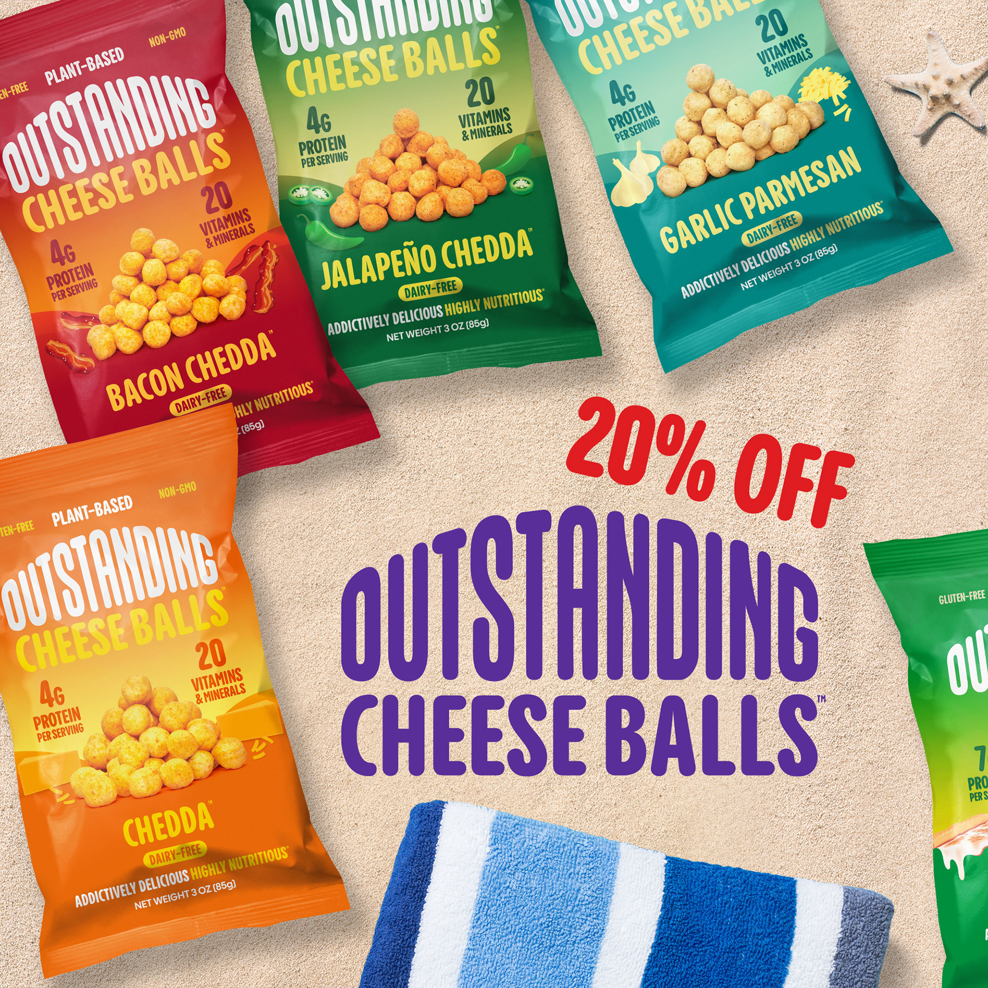
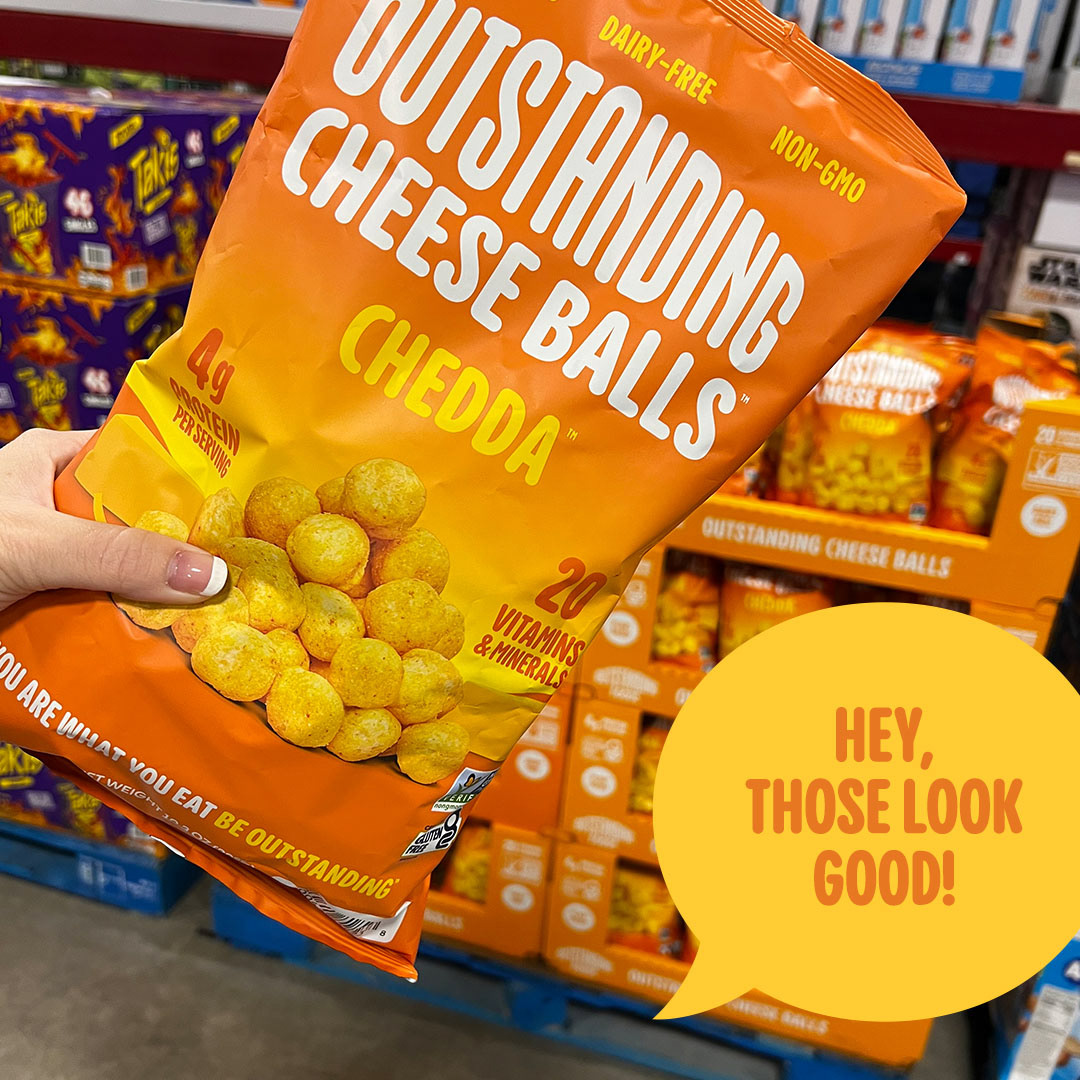
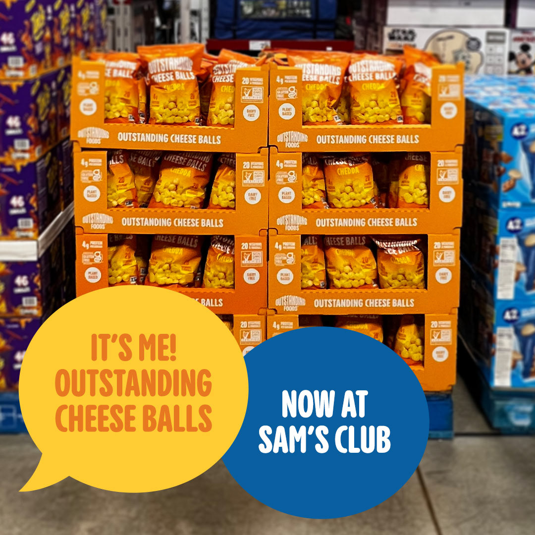
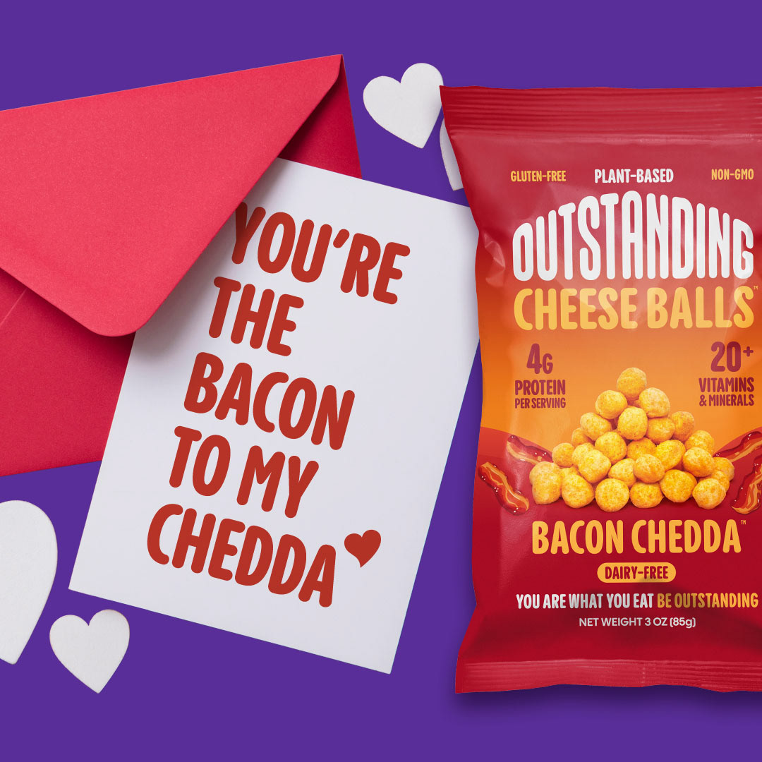
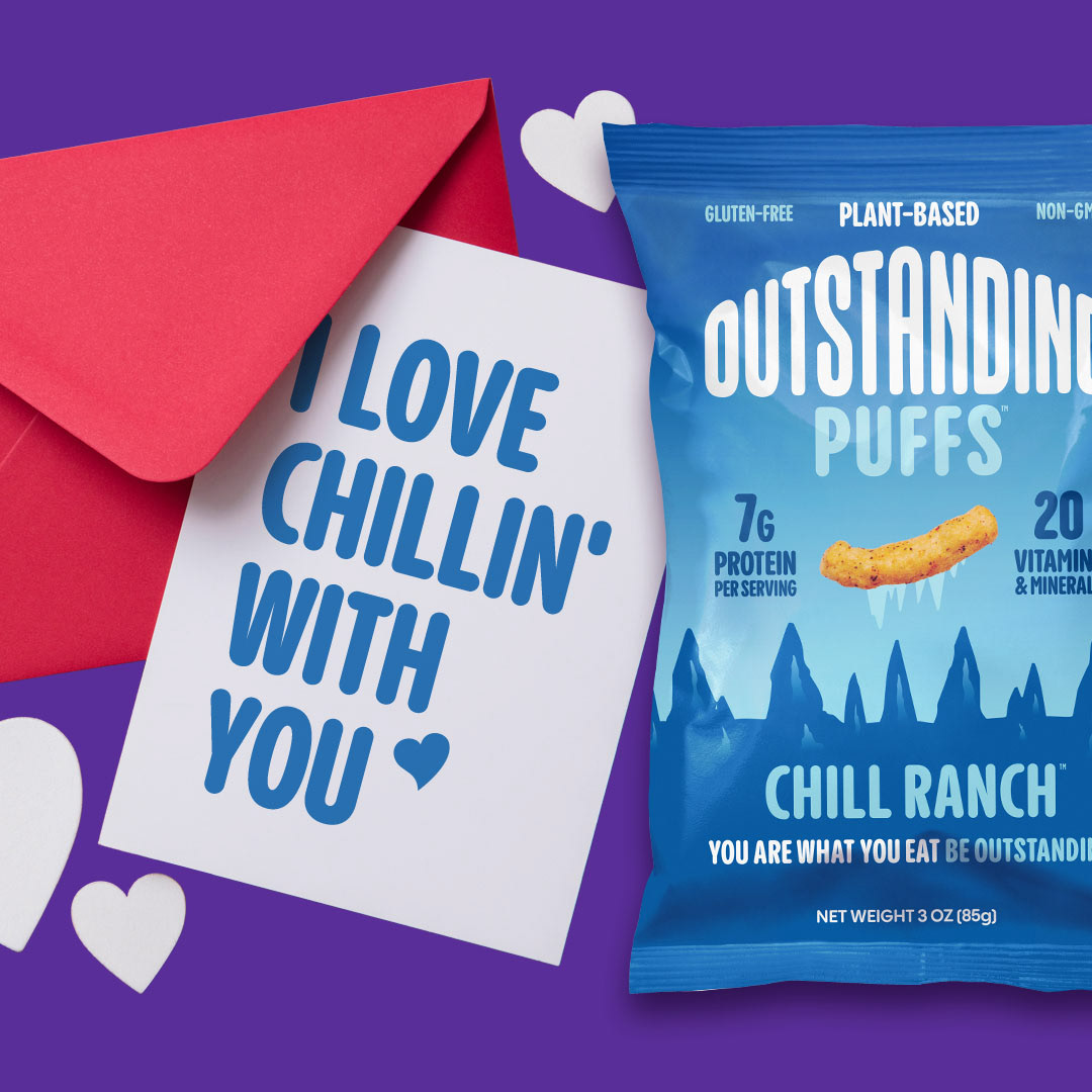
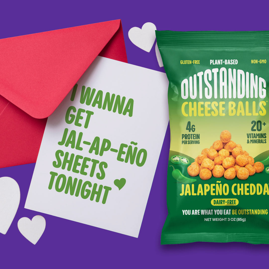
The evolution of Outstanding Cheese Balls continues with a packaging refresh in the works to compliment the colorful bags with equally colorful and contrasting elements. In this concept, key callouts are kept minimal and organized for easier understanding and product imagery of the cheese balls are dynamic and organic amongst the other elements in the layout becoming a fresh take on the previous pile shown on the packaging.
